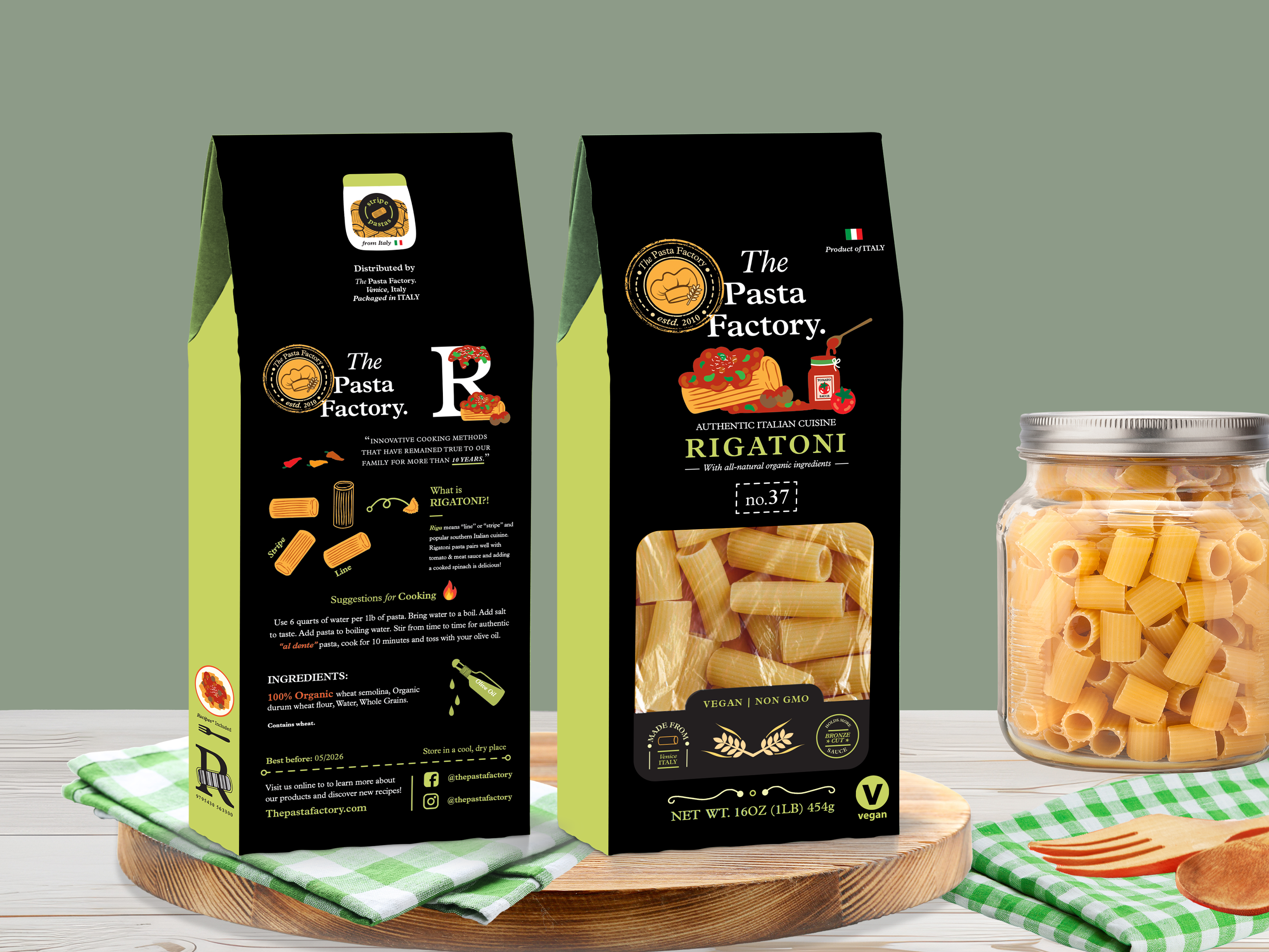
THE CHESHIRE Whiskey has been produced using premium English malted barley that is locally grown in Cheshire village. Cheshire has a history of evolution, renewal, and innovation from dairy farming, cheese making, and salt mining to pottery. Our branding and packaging are suitably premium and reflect our country's history, landscape, and buildings.
Visual Identity | Branding | Packaging
MID-TIER PACKAGING FOR "THE CHESHIRE"
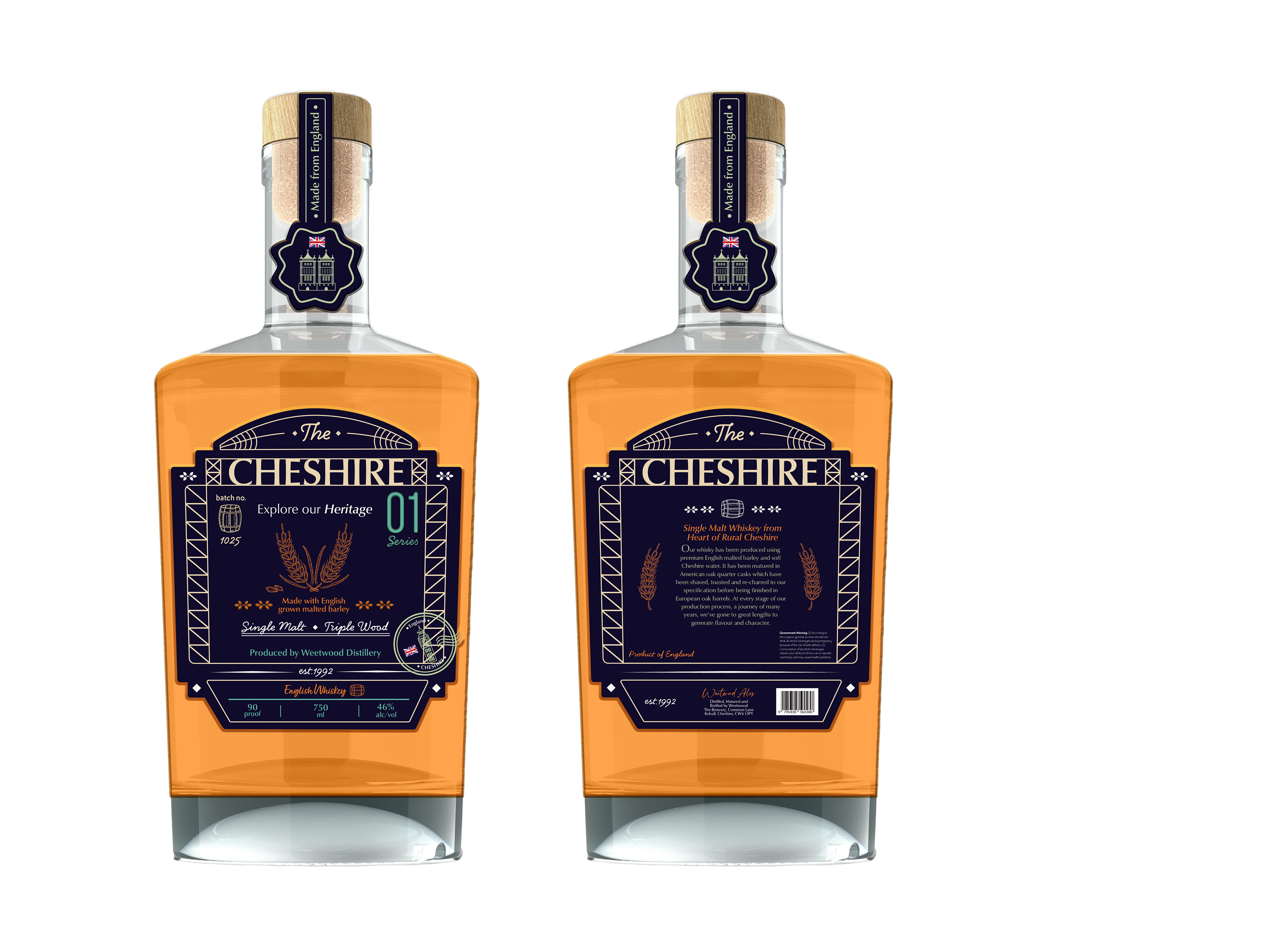
My designs for Mid-Tier play with lots of line work and outline as well as geometric elements that are inspired by the old Cheshire building structures and architectures. Since the distillery uses their grown English barley from the local area, I wanted to emphasize barley illustration that feels like a vintage mood drawing. The sealing label for the line work drawing reflects England's iconic buildings and gives a sophisticated look and feel.
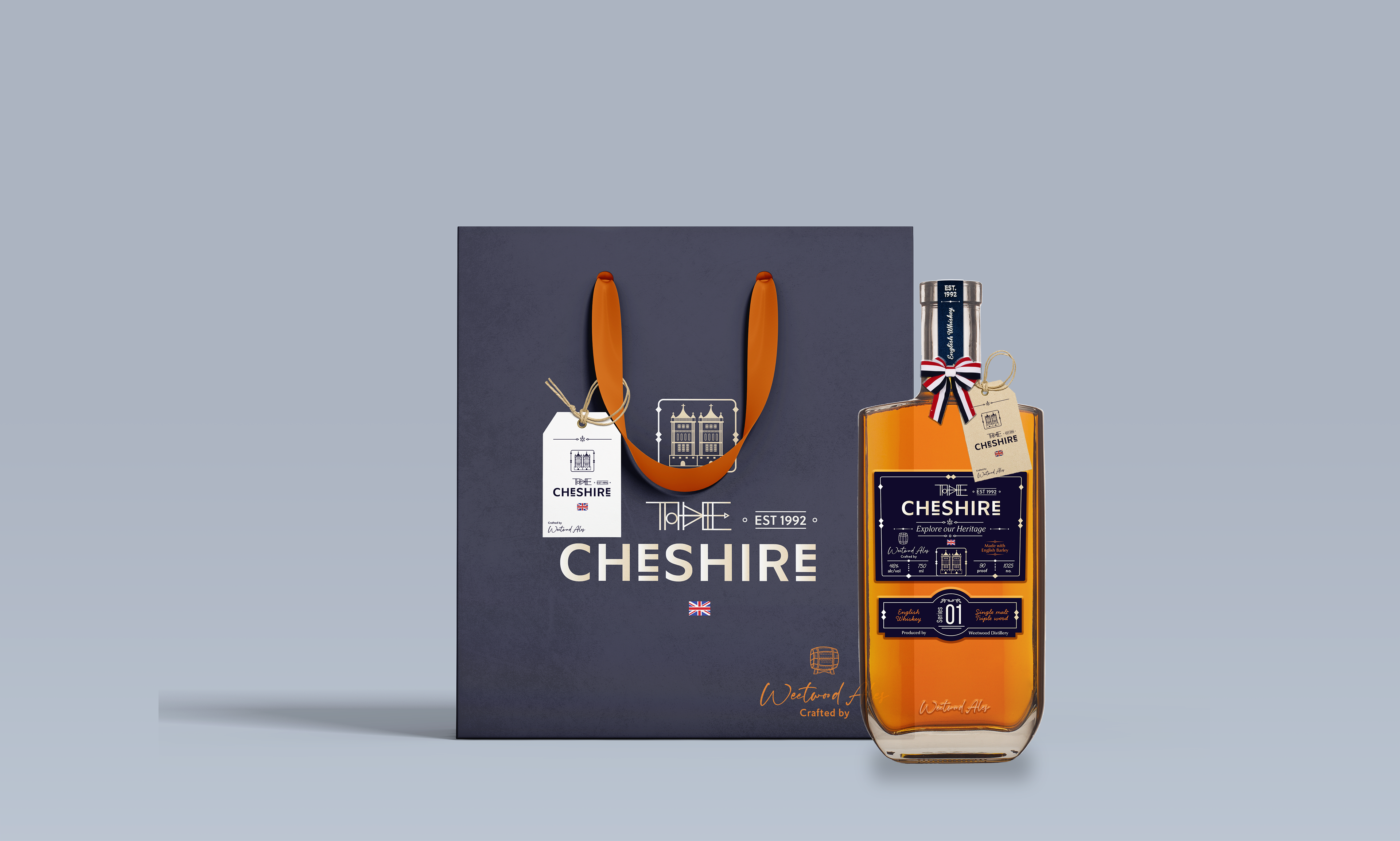
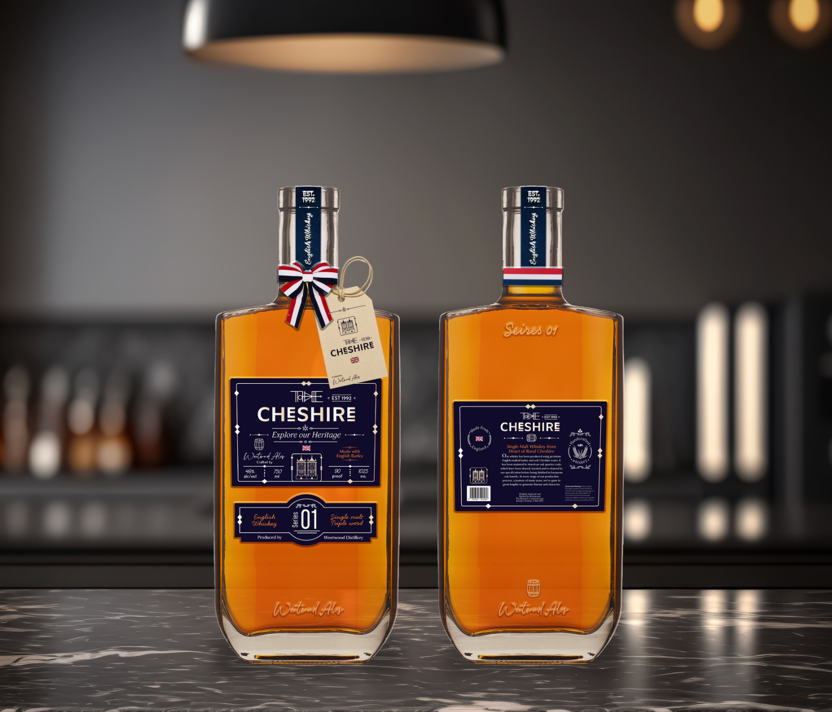
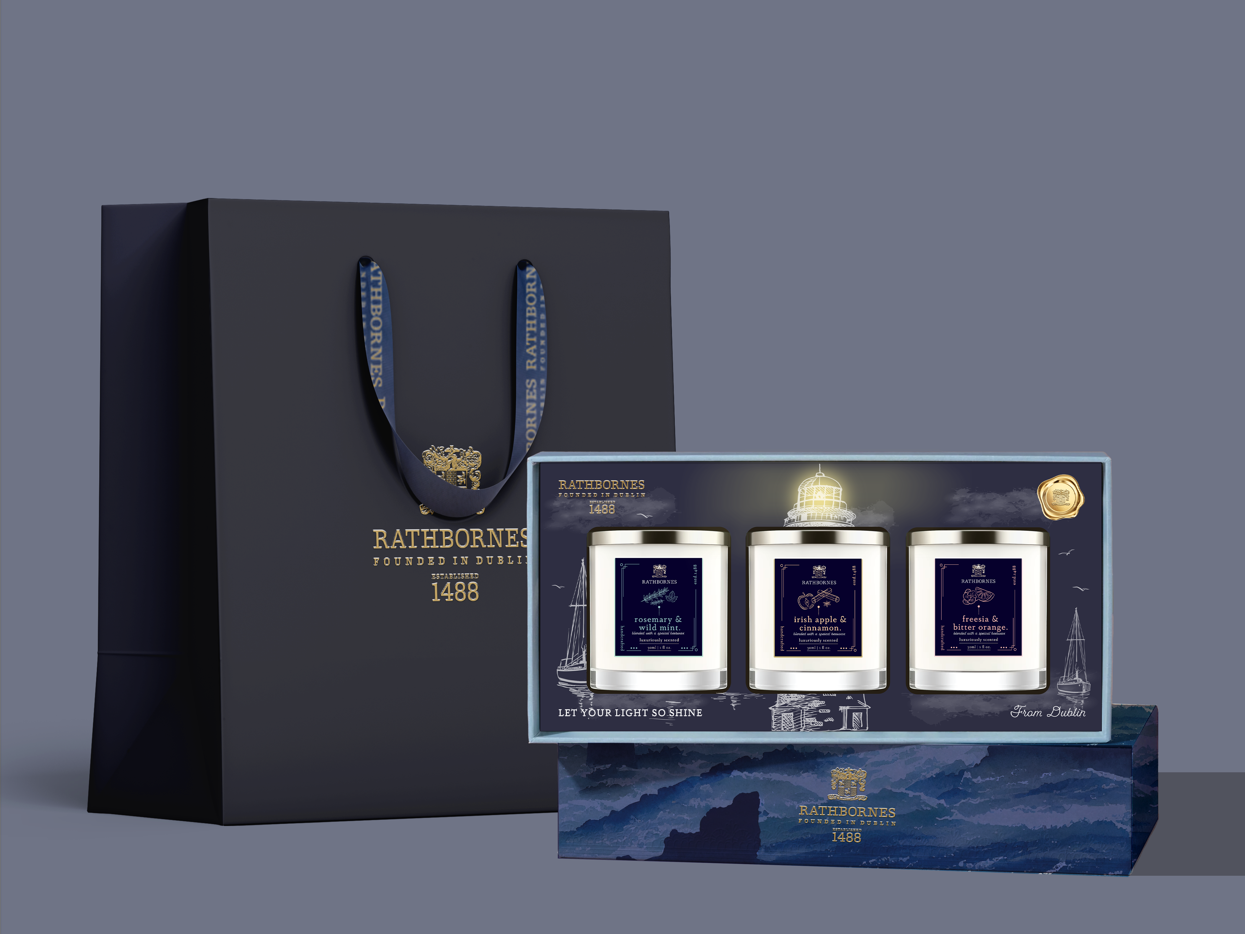
HIGH-TIER PACKAGING FOR "THE CHESHIRE"
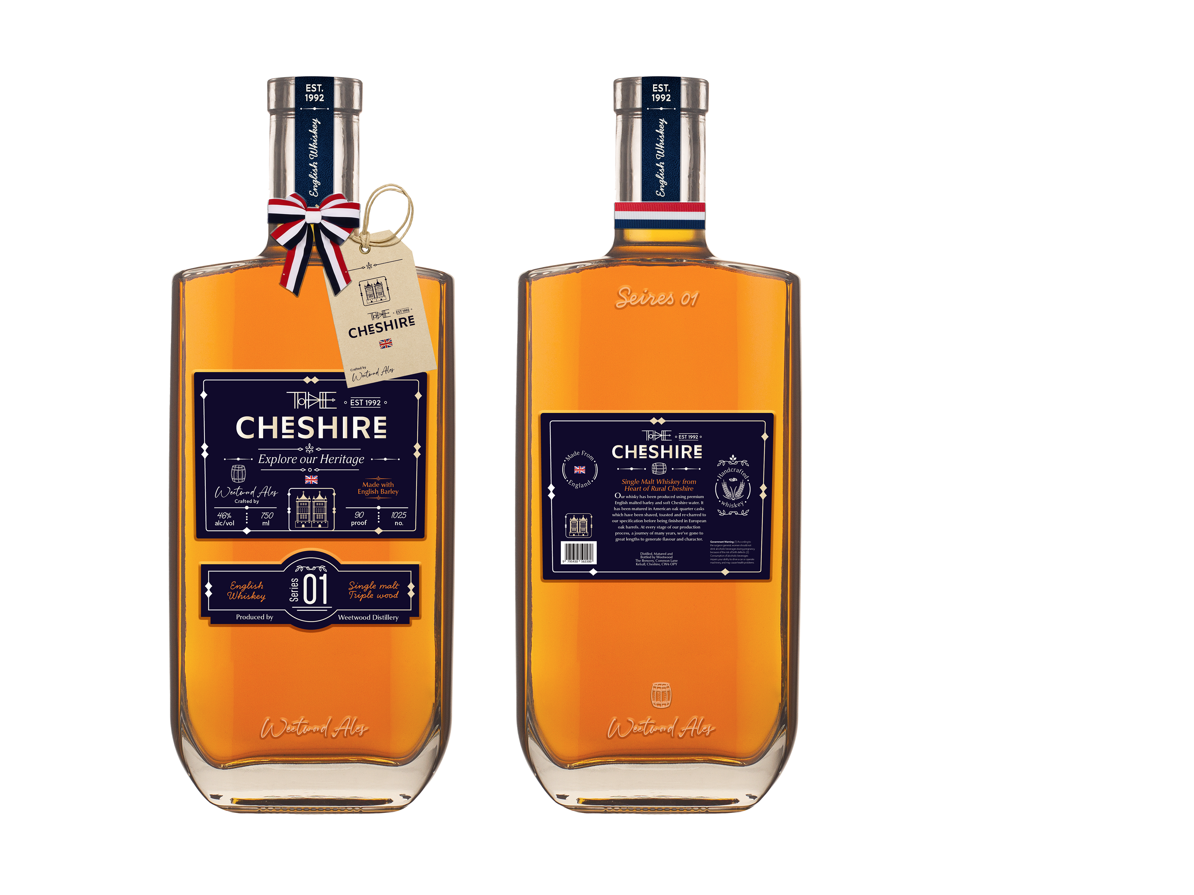
My design for High-Tier plays with elegant graphics and detailed line works to add luxurious look packaging to the consumers. I try to use minimal colors for the high-tier design and focused on labeling hierarchy and design. I photoshopped the bottle and used a metal cap to distinguish it from the mid-tier design. I also incorporated traditional England ribbon wrapped around the bottleneck and used a paper texture tag to add a vintage mood of the old CHESHIRE atmosphere.
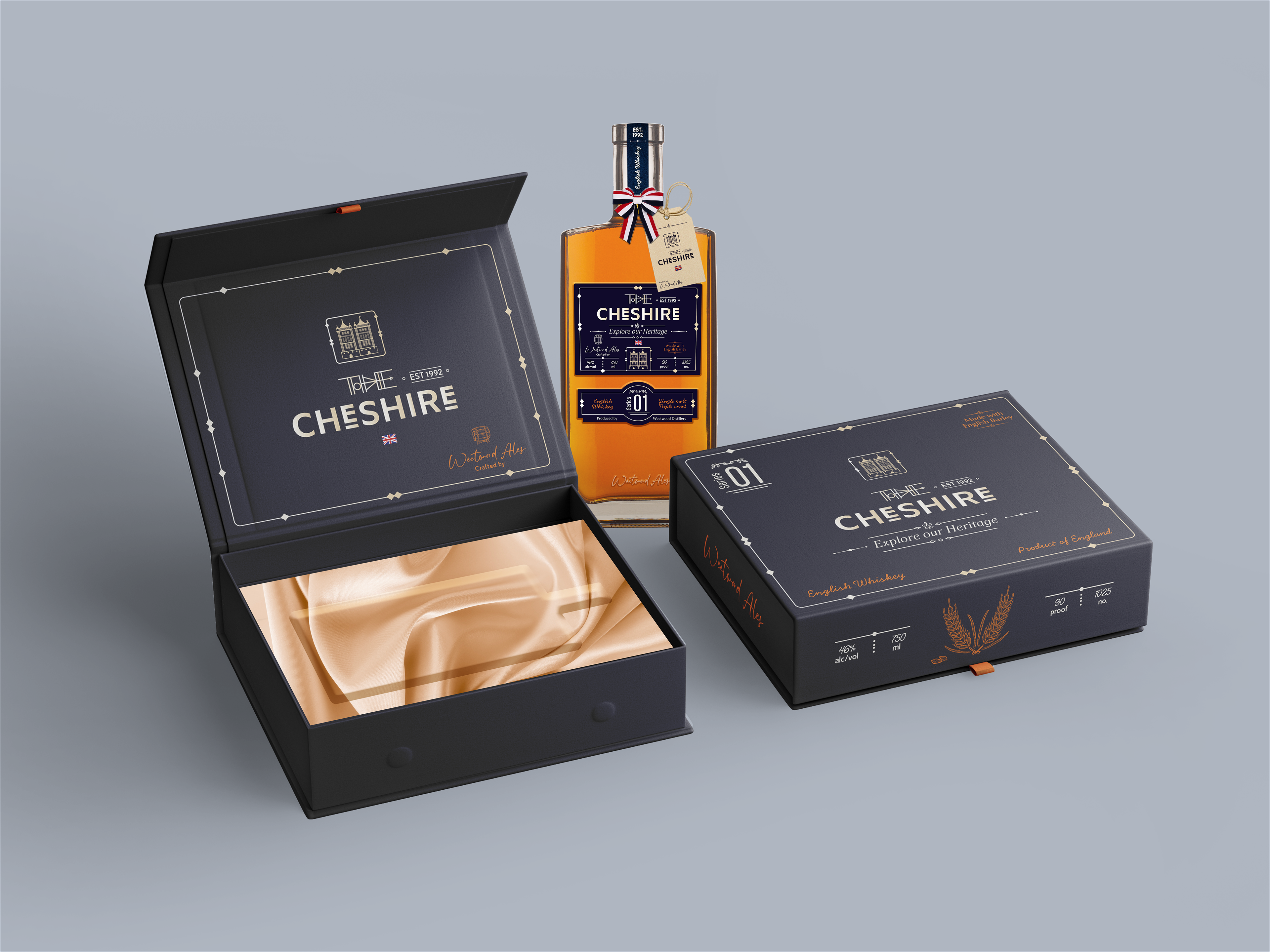
RIGID BOX PACKAGE DESIGN
WHISKEY PACKAGING | SHOPPING BAG